Have you ever thought about structuring your pages to present content in a clearer and more engaging way? The multi-column layout is a powerful feature for creating sections that are dynamic, easy to read, and adapted to different types of content. In this article, we will discover how the “multi-column” option can improve the aesthetics and ergonomics of your online store, and how the Shopify FullStack theme makes it easy to set up.
Why use a multi-column layout on your Shopify store?
In the age of infobesity, the Internet user's attention is getting shorter and shorter. To capture and hold this attention, there's nothing like a well-structured layout. The column view helps you:
- Highlight key information: Instead of a long block of text, you separate key points into columns, making it easier to read and understand.
- Vary the presentation: Texts, images, lists... Columns allow several elements to be juxtaposed in a balanced way, creating a harmonious visual effect.
- Ventilate the content: With a columnar design, you avoid the “text wall” effect and offer visitors increased reading comfort.
In 2025, nearly 65% of French-speaking e-commerce sites rely on multi-column layouts to boost their storytelling and highlight their product ranges. It is an essential tool to make your store more professional and engaging.
The advantages of multi-column layout for your e-commerce
- Enhanced clarity and readability Presenting information in columns (e.g. text on the left, visuals on the right) helps the reader to quickly identify important sections. This reduces eyestrain and increases the time spent on the page.
- Improving the conversion rate Better organized content makes it easier for your visitors to browse every corner of the page. They learn about your offers more easily and are more likely to click on a purchase or registration button.
- Flexibility to tell your story Whether you want to present step-by-step use, highlight testimonials or display product characteristics, the multi-column allows you to compose varied layouts, adapted to each need.
- Professional aesthetics Lined columns, sized images, and clean styling all contribute to a premium look and feel for your brand. Visitors often associate the visual quality of a site with the reliability of the products sold.
- Adaptability to any content From simple texts to photo galleries, including comparison tables or bulleted lists, the multi-column layout accommodates a wide range of formats. This allows you to structure all of your pages in a coherent manner.
The different uses of multi-column functionality
- “About” section: Present your brand story on one side, and a timeline, photo, or block of key figures on the other.
- Product comparison: Align several columns to detail, point by point, the characteristics of each reference.
- Text/image separation: On product pages, display marketing arguments in one column and visuals in the other, for a professional and dynamic result.
- Testimonial grid: Place several customer reviews side by side, for a striking and readable visual effect at a glance.
- Presentation of offers: Highlight your different formulas or product packs in columns, with distinct call to action (CTA) buttons.
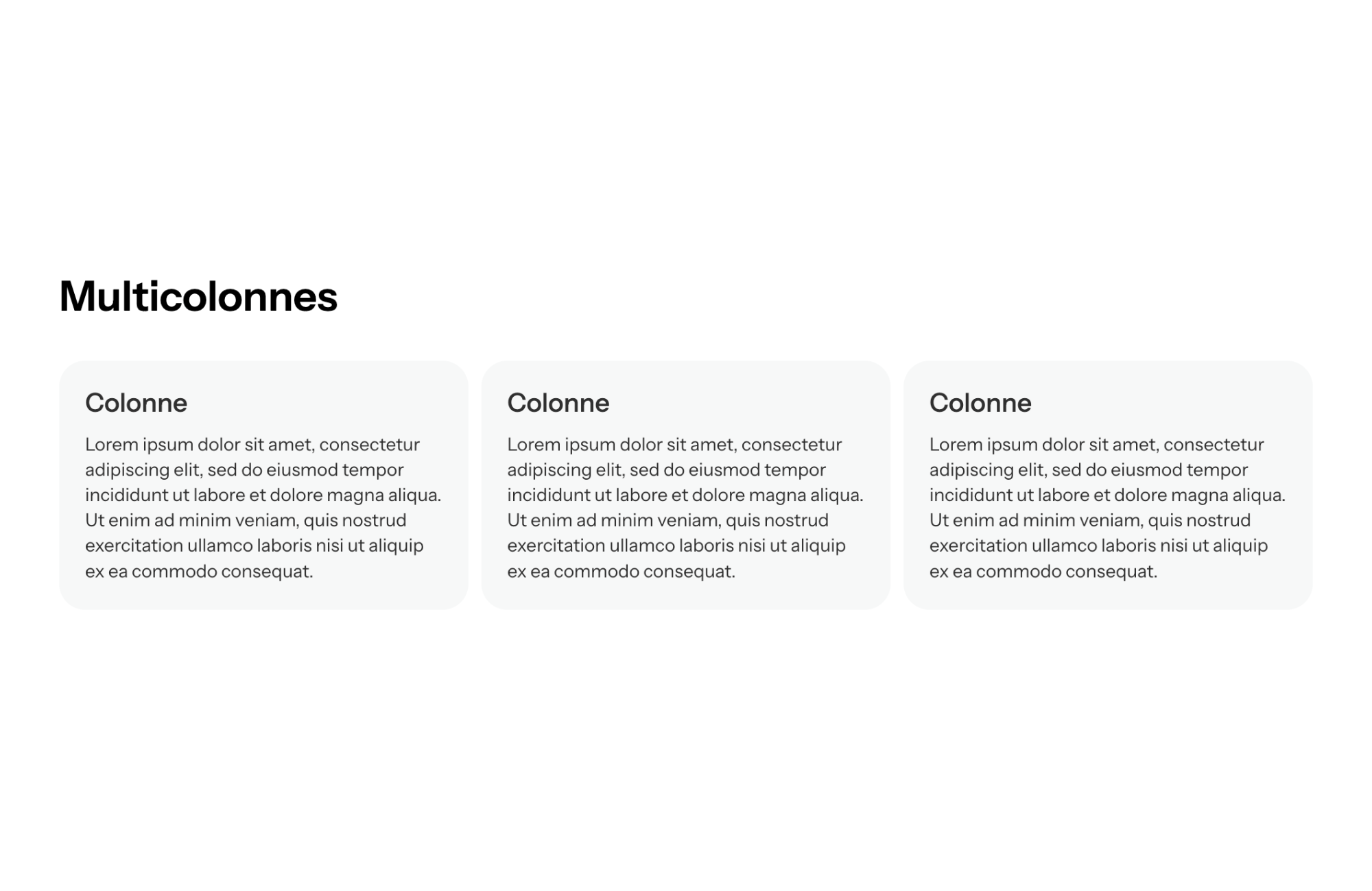
Depending on your strategy and brand identity, you can opt for 2, 3 or even 4 columns, in order to offer clear, airy and harmonious content.
How the FullStack theme makes multi-column layout easy
The Shopify theme FullStack Integrate a multi-column section turnkey, allowing you to easily customize the display:
- Creation in a few clicks From the editing interface, select “Multicolumn”, choose the number of columns you want, and add your content (text, images, videos...). FullStack takes care of alignment and optimization.
- Extensive customization You can adjust the width of the columns, the spacing, the background style (colors, patterns, gradients...), for a result that is perfectly consistent with your graphic charter.
- Mobile compatibility Thanks to FullStack's “responsive” design, your columns are intelligently reorganized on small screens. No more broken layouts: the theme adapts the layout to ensure optimal reading.
- Fast loading Scripts and images are loaded asynchronously, maintaining the speed of your store. Even with several columns filled with visuals, the site remains fluid, improving the user experience.
- Numerous templates included FullStack offers ready-to-use layouts (2, 3 or 4 columns), each available in several looks. So you can test different layouts and find the one that converts best.
On average, online retailers who have adopted FullStack's multi-column functionality see a Increase of 12% time spent on the pages, and a bounce rate reduced by 8% , a sign of better readability and a more pleasant customer journey.
Some key figures on the impact of multi-column layouts in e-commerce
- 55% of users say they leave a web page if they perceive the presentation as too “dense” or visually confusing.
- A structured layout can increase the conversion rate by up to 15%, by effectively guiding the visitor's eyes to key information.
- Column layouts are 20% more viewed in their entirety than a simple block of text, because they make you want to browse each section to discover the information it contains.
- In 2025, more than 70% of professional sites (storefront and e-commerce) are using multi-column designs to offer increasingly important visual storytelling.
Optimize your multi-column layout for better performance
- Use clear titles and subtitles Each column should have a title or an eye-catching element (icon, visual) to catch the eye and facilitate navigation.
- Balance content Avoid making one column much longer than the other: try to distribute text, images, and CTAs evenly.
- Ensure readability Choose a suitable font size, sufficient contrast between text and column background, and airy spaces so as not to saturate the screen.
- Test different structures Do A/B tests by varying the number of columns, image placement, and background colors to measure the impact on reading time and click rate.
- Do not forget the mobile Always check the display on smartphone and tablet. If you have a lot of content, maybe choose 2 columns to avoid overloading the mobile view.
Conclusion
The multi-column feature is a essential asset to boost your pages and make your content more digestible. By intelligently segmenting information, images, and CTAs, you make it easier to read, promote your products, and encourage your visitors to take action.
The FullStack Shopify theme greatly simplifies your task: its intuitive interface , its varied templates and its fast charging offer you a wide field of experimentation to create pages that look professional and captivating. In a competitive market where clarity and aesthetics make the difference, multi-column layout helps you Stand out from the crowd and to turn more visitors into happy customers.


.svg)
.svg)